The best design solution for any given form depends on many factors: the length of the form, the context of use, and the data being collected. The exact implementation you should use may vary in certain circumstances, but this is no excuse for ignoring guidelines altogether. Instead, use these recommendations as a starting point, and if you stray from these established best practices make certain you have a good reason for doing so.
Only Ask What’s Required
Make sure you only ask what you really need. Every extra field you add to a form will affect its conversion rate. That’s why you should always question why and how the information you request from your users is being used. Remove fields which collect information that can be (a) derived in some other way, (b) collected more conveniently at a later date, or (c) simply omitted.
Order the Form Logically
Details should be asked logically from a user’s perspective, not the application or database logic. Typically, it’s unusual to ask for someone’s address before their name.
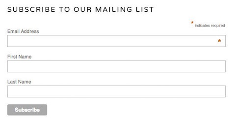
Group Related Information
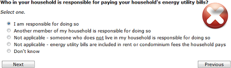
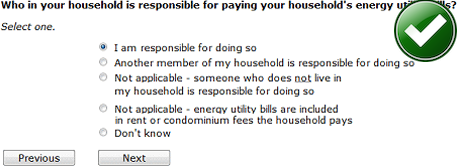
You should group related information in logical blocks or sets. The flow from one set of questions to the next will better resemble a conversation. Grouping related fields together also helps users make sense of the information that they must fill in. Below is an example for Contact Information.
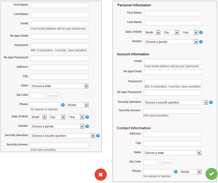
Improve the layout of your online forms by placing form labels near the associated text field and by grouping similar fields.

One Column vs. Multiple Columns
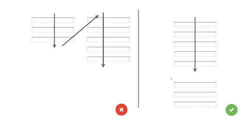
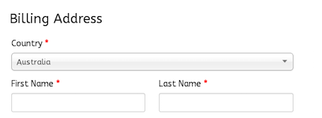
Forms should never consist of more than one column. One of the problems with form fields in multiple columns is that your users are likely to interpret the fields inconsistently. If a form has horizontally adjacent fields, the user must scan in Z patterns, slowing the speed of comprehension and muddying the clear path to completion. But if a form is in a single column, the path to completion is a straight line down the page. (Exceptions to this rule: short and/or logically related fields such as City, State, and Zip Code can be presented on the same row.)
Use logical sequencing
Stick to standard sequences both for fields (e.g., Credit-card number, Expiration date, Security code) and for value choices (e.g., Standard shipping, 2-day shipping, 1-day shipping). But for field values, also consider usage frequency, and list the most common values first when possible. Help keyboard users by testing the Tab-key navigation to ensure it follows the correct field sequence.
Avoid Reset and Clear buttons
The risk of accidental deletion outweighs the unlikely need to ‘start over’ on a web form. In forms that collect extremely sensitive input such as financial information, provide a ‘Cancel’ button to support those users who abandon the form and want to delete their information. But make sure that the Cancel button has significantly less visual prominence than the Submit button, to avoid accidental clicks.
Number of Fields
Try to minimize the number of fields as much as possible. This makes your form less loaded, especially when you request a lot of information from your users. However don’t over do it, no one likes a three field form that turns into a 30 field interrogation.
Mandatory vs Optional
Try to avoid optional fields in forms. But if you use them, you should at least clearly distinguish which input fields cannot be left blank by the user. The convention is to use an asterisk (*) or ‘optional’ (which is a preferable for long forms with multiple required fields)
Setting Default Values
You should avoid having a static default unless you believe a large portion of your user’s (e.g. 90%) will select that value. Particularly if it’s a required field. Why? Because you’re likely to introduce errors because people scan forms quickly online — don’t assume they will take the time to parse through all the choices. They simply may blithely skip by something that already has a value. But smart defaults can make the user’s completion of the form faster and more accurate. For example, pre-select the user’s country based on their geo location data. But still you should use these with caution, because users tend to leave pre-selected fields as they are.
Desktop-only: Make Form Keyboard-friendly
Users should be able to trigger and edit every field using only the keyboard. Power users, who tend to use keyboards heavily, should be able to easily tab through the fields and make necessary edits, all without lifting their fingers off the keyboard. You can find detailed requirements for keyboard interaction pattern in W3C’s Authoring Practices for Design Patterns
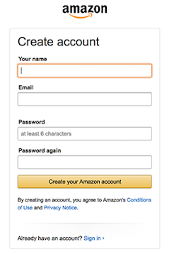
Desktop-only: Autofocus for Input Field
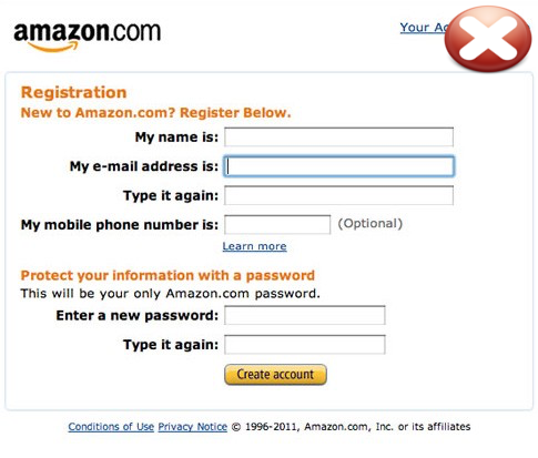
Autofocusing a field gives the users an indication and a starting point to quickly begin to fill out the form. You should provide a clear visual ‘notification’ that the focus has moved there — change color, fade in a box, flash in an arrow, whatever. Amazon registration form has both autofocus and visual notification for the user.
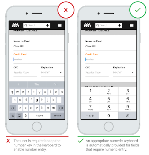
Mobile-only: Match the Keyboard With the Required Text Inputs
App users appreciate apps that provide an appropriate keyboard for text entry. Ensure that this is implemented consistently throughout the app rather than only for certain tasks but not others.
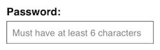
Explain any input or formatting requirements.
If a field requires a specific format or type of input, state the exact instructions. Don’t make users guess your obscure password requirements. The same applies to syntax rules such as punctuation or spacing for phone numbers or credit cards. (Though as much as possible you should eliminate these arbitrary formatting rules: death to parentheses for phone-number area codes!)
Number of Words
Labels are not help texts. You should use succinct, short and descriptive labels (a word or two) so users can quickly scan your form. Previous version of the Amazon registration form contained a lot of extra words which resulted in slow completion rates.
Sentence Case vs Title Case
Should it be “Full Name” or “Full name”? Sentence case is slightly easier (and thus faster) for reading than title case. But one thing for sure — you should never use all caps, or else the form would be difficult to read and much harder to quickly scan, as there are no differences in character height any more.
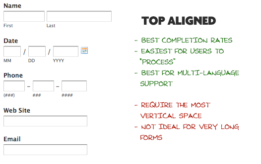
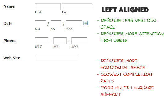
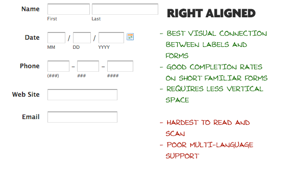
Alignment of Labels: Left vs Right Aligned vs Top
Matteo Penzo’s 2006 article on label placement implies that forms are completed faster if the labels are on top of the fields. They are good if you want users to eye-scan the form as fast as possible.
However further research mentioned found no difference between labels above the fields and right-aligned labels.
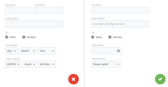
Placeholders in Form Fields Are Harmful
Placeholder text within a form field makes it difficult for people to remember what information belongs in a field, and to check for and fix errors. It also poses additional burdens for users with visual and cognitive impairments.
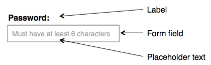
Labels and Placeholders
Labels tell users what information belongs in a given form field and are usually positioned outside the form field. Placeholder text, located inside a form field, is an additional hint, description, or example of the information required for a particular field. These hints typically disappear when the user types in the field.
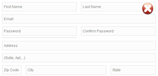
Placeholders that Replace Labels
Some forms replace field labels with in-field placeholder text to reduce clutter on the page, or to shorten the length of the form.
According the NNGroup there are 7 main reasons why placeholders should not be used as replacements for field labels:
- Disappearing placeholder text strains users’ short-term memory.
- Without labels, users cannot check their work before submitting a form.
- When error messages occur, people don’t know how to fix the problem.
- Placeholder text that disappears when the cursor is placed in a form field is irritating for users navigating with the keyboard.
- Fields with stuff in them are less noticeable.
- Users may mistake a placeholder for data that was automatically filled in.
- Occasionally users have to delete placeholder text manually.
Placeholder Text in Addition to Labels
Using placeholder text in combination with form labels is a step in the right direction. Labels outside the form fields make the essential information visible at all times, while placeholder text inside form fields is reserved for supplementary information. However, even when using labels, placing important hints or instructions within a form field can still cause the 7 issues mentioned above, albeit with less severity. If some of the fields require an extra description that is essential to completing the form correctly, it’s best to place that text outside the field so that it is always visible.
Placeholders and Accessibility
One last issue to consider is that placeholder text is generally bad for accessibility.Three of the biggest problems for accessibility are as follows:
- The default light-grey color of placeholder text has poor color contrast against most backgrounds.
- Users with cognitive or motor impairments are more heavily burdened.
- Not all screen readers read placeholder text aloud.
Floatling Labels (Adaptive Placeholders)
Good solution for the placeholder text is a floating label (also known as adaptive placeholder). The placeholder text is showing by default, but once an input field is tapped and text is entered the placeholder text fades out and a top aligned label animates in. As a result, the adaptive placeholder (also known as the float label) is always visible, either in the center of the form field, or above the text that the user entered.
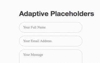
There are two main advantages to this approach:
- It can save space on mobile devices, by not requiring extra vertical space to put the label above the field.
- The visible label serves as a memory aid while people are in the typing stage. This therefore addresses points 1-4 from the list of pitfalls above.
However, issues #5 and #6 from above are still a problem: fields with text in them are less noticeable, and users might think there is already a default value entered in the field.
Ultimately, adaptive placeholders do offer a better user experience than the label as a placeholder. But if you have the screen space, placing the label and hint outside the field is still the best way to go.
When clicked, these buttons trigger an action such as submitting the form.
Visual Appearance
Make sure action buttons look like buttons—with a bit of shading on their surface or around their edges to make them stand out from the background and look clickable. For more information about button you can read article Button UX Design: Best Practices, Types and States


Visual Feedback
You should design your submit button in a way that it should clearly indicate that the form is being processed after user’s action. This provides feedback to the user whilst also avoiding double posts.
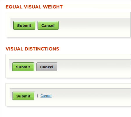
Primary vs Secondary Actions
Lack of visual distinction between primary and secondary actions can easily lead to failure. Reducing the visual prominence of secondary actions minimizes the risk for potential errors and further directs people toward a successful outcome.
Button Location
On a Web page, it’s all about knowing what catches your users’ attention and inspires them to action.
OK-Cancel or Cancel-OK?
Both are reasonable choices, and people can argue for hours about their preferences:
- Listing OK first supports the natural reading order in English and other languages that read left-to-right. Many other button sets have a natural progression (say, Yes/No or Previous/Next). You should always list these so that the reading order matches the logical order — in this case, OK/Cancel . Further, assuming users need OK much more frequently than Cancel, it's better to place this option first so that keyboard-driven users who tab to the buttons can get to their preferred choice with one less keystroke.
- Listing OK last improves the flow, because the dialog box "ends" with its conclusion. Also, as with Previous/Next, you could argue that OK is the choice that moves the user forward, whereas Cancel moves the user back. Thus, OK should be in the same location as Next: on the right.
Put buttons in a sensible order
If the primary action button needs to be where users look next, where should the other buttons go? You should tuck the other buttons away somewhere users won’t stumble upon them too easily.
Naming Conventions
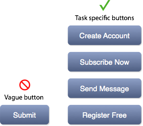
Avoid generic words such as “Submit” for actions, because they give the impression that the form itself is generic. Instead state what actions the buttons do when clicked, such as ‘Create my FREE account’ or ‘Send me weekly offers’.
Multiple Action Buttons
Avoid multiple action buttons since it might distract users from the goal (submitting the form).
Reset: Don't Use
Don't use a reset button. The web would be a happier place if virtually all Reset buttons were removed. This button almost never helps users, but often hurts them.
Cancel: Use Sparingly
The Web is not an application environment, and it usually doesn't have dialog boxes. Instead, the Web is a navigation environment where users move between pages of information. Since hypertext navigation is the dominant user behavior, users have learned to rely on the Back button for getting out of unpleasant situations. Whenever users arrive at pages they don't want, they slam their mouse directly onto the Back button.
Cancel is mainly useful for multi-step dialogs where the user has progressed past one or more pages with actions. At this time, pressing the Back button will not undo these actions and it would be better if the user would click Cancel.
Error Message Guidelines (NNGroup, Material.io)
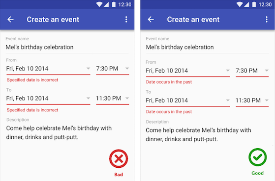
Good error messages are polite, precise, and constructive. The Web brings a few new guidelines: Make error messages clearly visible, reduce the work required to fix the problem, and educate users along the way.
One of the 10 Usability Heuristics advises that it’s important to communicate errors to users gracefully and clearly. An effective error message provides following information:
User input validations are meant to have conversations with users and guide them through the difficult times of errors and uncertainty. The output of this process is emotional rather than technical. The primary principle of input validation is this: “Talk to the users! Tell when them what is wrong!”
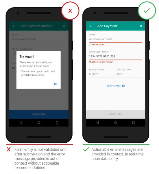
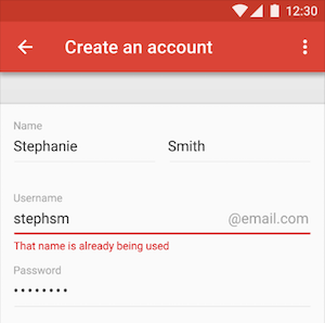
Right Time and Place (Inline Validation) (AListAPart, ConversationXL, Material.io)
Real-time inline validation immediately informs users about the correctness of provided data. If you are performing inline form validation, and the field with the error is clearly marked, the submit button may be disabled until the error is corrected. It allows users to correct the errors they make faster without having to wait until they press the submit button to see the errors.
Instant validation should be implemented carefully and in appropriate cases because it might be distracting if overused or misused.
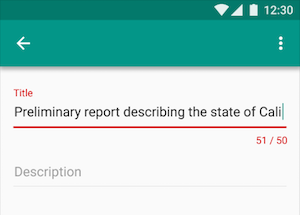
The best error message is the one that never shows up. It is always best to prevent errors from happening in the first place by guiding users in the right direction ahead of time. But when errors do arise, a well-designed error handling not only help teach users how to use the app as you intended, but they also prevent users from feeling ignorant.
Right Color (Intuitive Design)
Color is one of the best tools to use when designing validation. Because it works on an instinctual level, adding red to error messages and yellow to warning messages is incredibly powerful. Error text should be legible, with noticeable contrast against its background color. But make sure that colors in your digital interface are accessible for your users, it’s a really important aspect of a well executed visual design.
Clear Message (What Happened)
Make sure to use a human-readable language, instead of obscure codes or abbreviations such as "An error of type 2 has occurred." Your validation message should clearly state (a) What went wrong and possibly why and (b) What’s the next step the user should take to fix the error.